Stripe Average Coloring
Very Plotter has been updated to version 0.9.0!
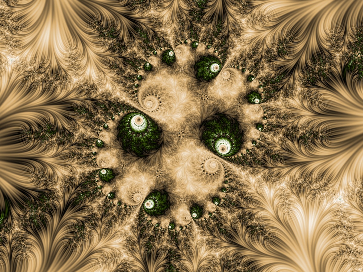
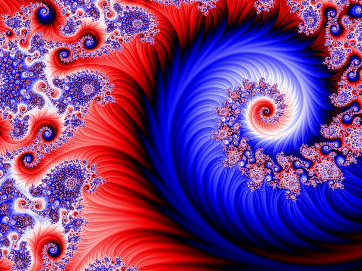
This release includes a few smaller nice things but the biggest new feature is Stripe Average Coloring (demonstrated in the image here).
Stripe Average Coloring is a completely different way to color the pixels of the Mandelbrot set than traditional iteration count coloring. It does a terrific job of adding beautiful detail to the areas that look empty, smooth, and featureless in iteration count images.
In this post we'll look at this coloring method and some example images created with it.
Using Stripe Average Coloring in Very Plotter
- Click the wrench button to open the controls menu
- Expand the "gradient editor" section
- Add a zero to the gradient's "-mod#" option, or add "-mod50000" if there isn't already a "-mod#" option present
- Click the "Go" button to apply the gradient
- Expand the "algorithm options" section
- In the "options" dropdown list, select "automatic with stripes coloring"
- Click the "Go" button to run the new algorithm
This will set the algorithm to either basic escape time or perturbation theory depending on the depth/scale of the location being viewed.
There are other options in that dropdown list for explicitly using either the stripe-coloring escape time algorithm or the stripe-coloring perturbation theory algorithm.
If you want to customize the "stripe density," select one of those options (use perturbation theory beyond scales of ~3e13) and change the -stripedensity# parameter in the "algorithm" text box.
Use a stripe density of 2 for short, wide stripes:basic-stripes-stripedensity2-float
Use a higher stripe density of 10 for longer, narrower stripes:basic-stripes-stripedensity10-float
If you use an odd number, you'll see long "arcs" cutting across the image:basic-stripes-stripedensity7-float
Stripe Coloring Tips
- You'll often need to use a gradient with a large "-mod#" option: try the examples below to and look at the "gradient editor" section of the controls menu
- The "stripe density" can go all the way to 100, but I've found values of 4, 6, and 8 to be the most useful
- In the "smooth and slope" section of the controls menu:
- make sure "large bailout" is enabled
- the "smooth" setting has no effect
- you'll almost certainly want "slope shading" turned off because it creates abrupt pointy features in the smooth areas of the stripes
The Stripe Average Coloring Algorithm
This algorithm was first described by Jussi Härkönen in a paper from 2007. I was able to find and download a copy of the paper from the Internet Archive Wayback Machine (the "lo-res" version of the paper was available on that Wayback Machine archived page). The paper provides lots of thorough discussion on some coloring methods, but is not terribly instructive for those of us that are less mathematically inclined.
A 2012 thread on the fractalforums.com, specifically this post by the user "Syntopia", helped me get my implementation working.
In a nutshell, Stripe Average Coloring is one type of "average coloring" algorithms. These algorithms apply a function to the coordinate of each iteration of the orbit calculated for each pixel, and take the average. This particular algorithm uses the sin() function for each iteration of the orbit (upon the angle between that coordinate and the origin, and the real axis).
Say, for example, among the iterations in the orbit calculated for a pixel we have the location . This coordinate lies upon the real axis, thus forming an angle of 0º from that axis. The coordinate creates a 90º angle, perpendicular to the real axis. The value , at halfway between the real axis and imaginary axis, therefore represents a 45º angle.
By taking the average of the sin() value of each of those angles represented by each iteration of the orbit (then multiplying by some scaling factors), we end up with a value that can be plugged into Very Plotter's existing color gradients to select a color for a pixel.
For more background on complex numbers and Very Plotter's escape time and perturbation theory algorithms, see this blog post.
Comparison with Iteration Coloring
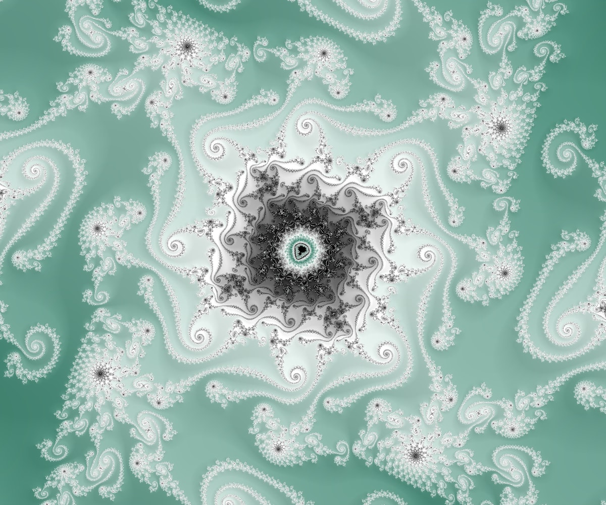
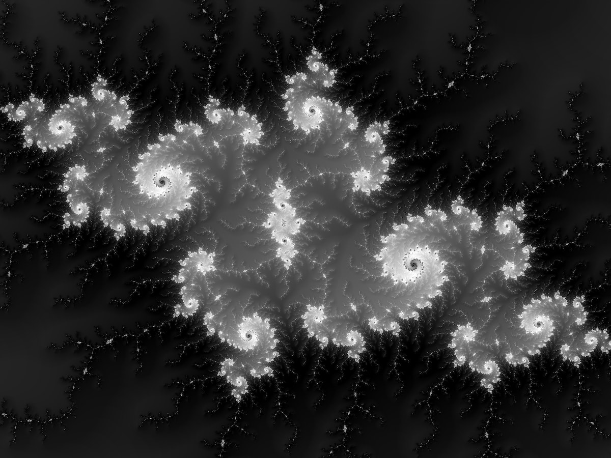
With iteration count coloring:
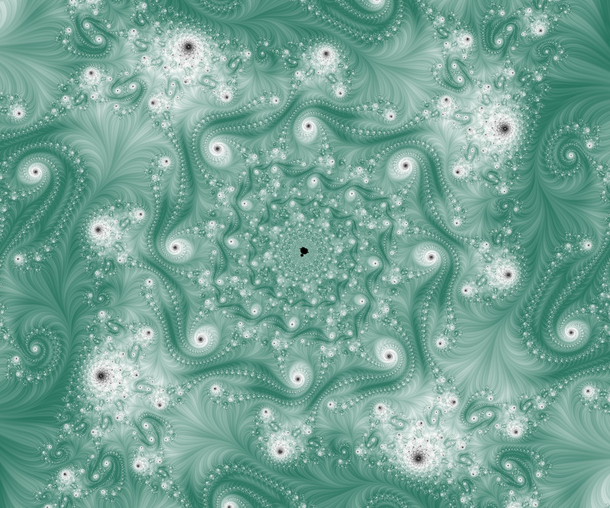
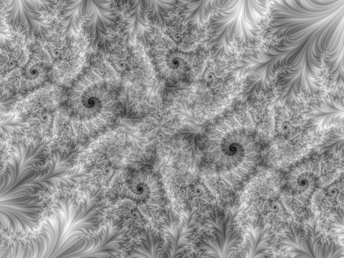
The same location with stripe average coloring:
The above comparison shows how much more detail is present in the areas that are smooth and "empty" when colored with the iteration count method. But it also shows how stripe average coloring can start to get very "busy" even at shallow depths (the above location is only at a scale of 3e13).
In this example, we have a nice iteration-colored Julia island:
And below is the same location with stripe coloring. This location is at only ~4x the depth of the above image at 1e14. You can see how much more "busy" it looks — you can barely make out the formations in the above image!
It looks like stripe coloring therefore becomes less and less useful as we render locations at larger and larger scales. In fact, Very Plotter only implements stripe coloring with floating point math for the basic escape time Mandelbrot algorithm and for the perturbation theory algorithm. Arbitrary-precision math and series approximation allow much deeper zooms but it doesn't appear that there's any point in implementing stripe average coloring for them, since those renders would just appear to be a dense mess.
One way to take advantage of stripe average coloring at medium scales, like the above example, is to combine both iteration coloring and stripe average coloring:
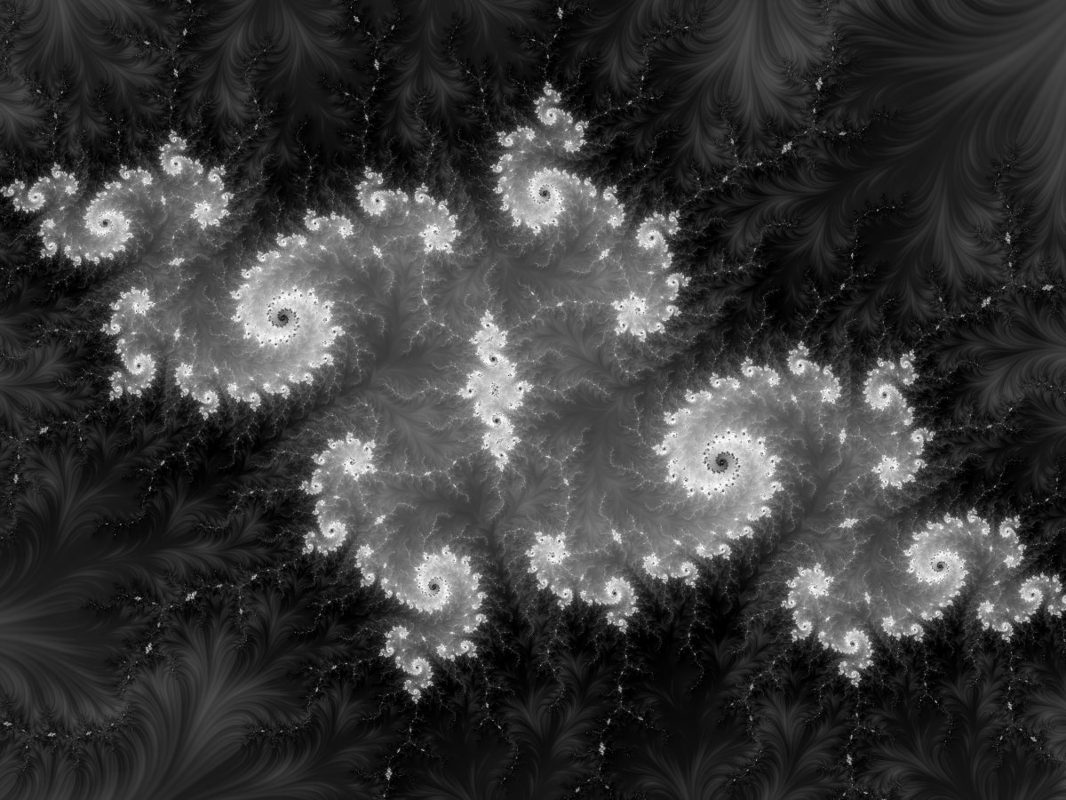
The above image uses the stripe render as a "hard light" overlay on top of the iteration render. Any layers-based photo editor can overlay images like this.
Example Images
Below are a few examples I found while working on stripes average coloring. I'll likely also be adding more stripes coloring images to the Very Plotter Mandelbrot set gallery. Click any image to visit that location in Very Plotter.
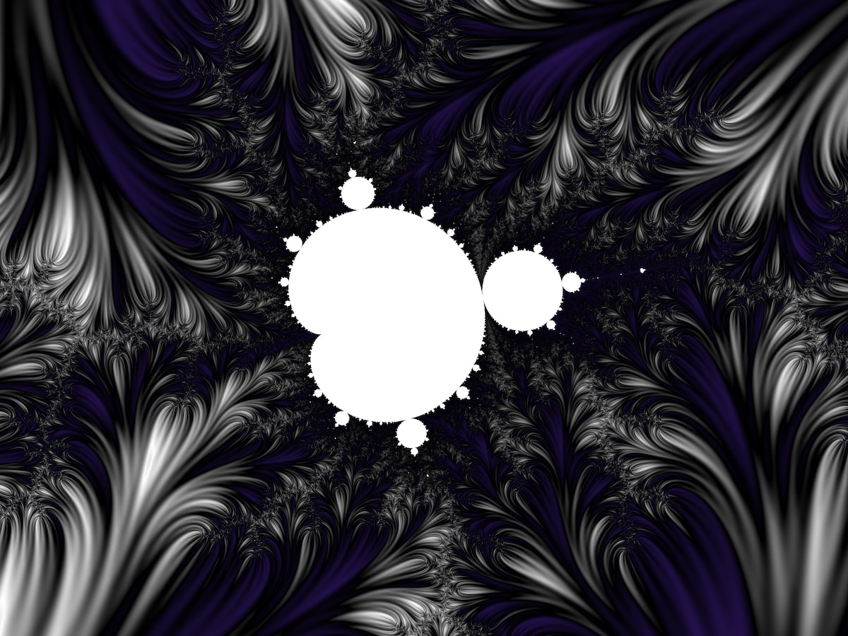
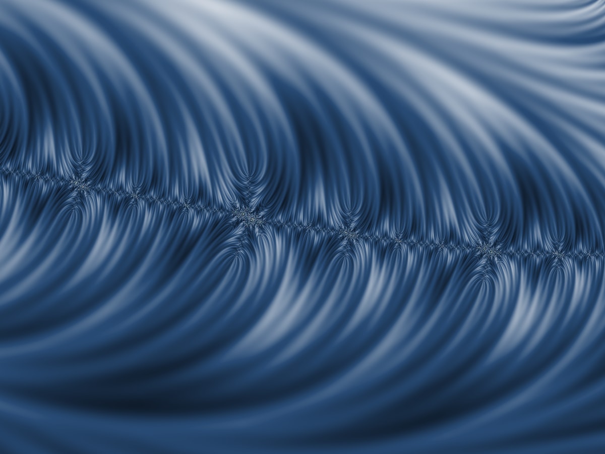
I didn't expect this coloring algorithm to create such amazing smooth features that look like pulled fabric:
In the next image, you can see how the there is too much noise in the detail of these formations. On the other hand, the big empty swaths between the formations is filled very nicely with color-changing branches:
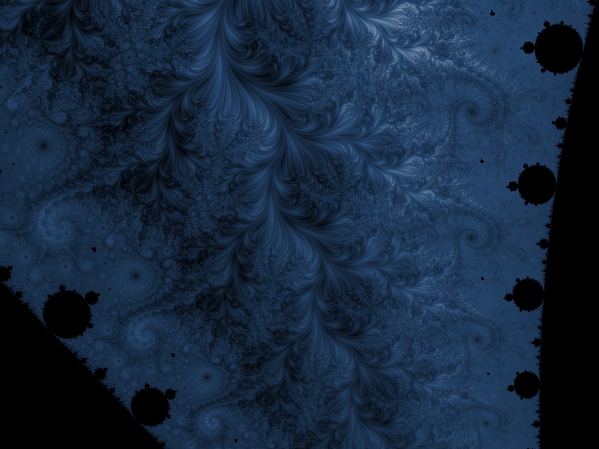
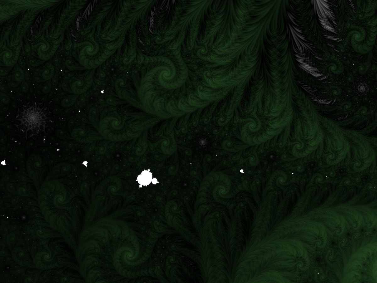
Darker gradients can create an entirely different feeling:
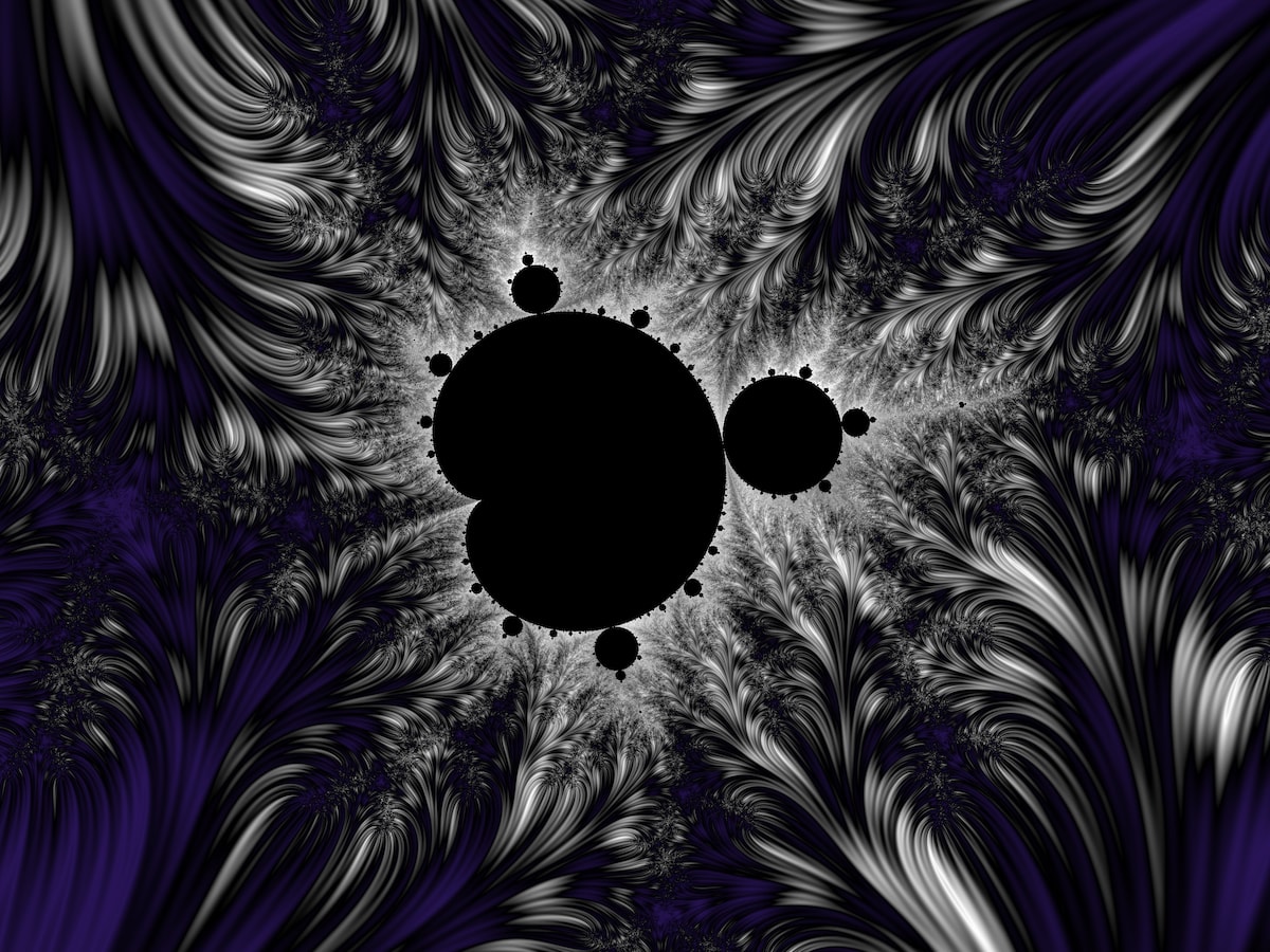
Finally, here is the location used for this article's lead/thumbnail image, and a similar alternate:


